| 1 |
# Checking outlines after extrapolation |
| 2 |
|
| 3 |
It was necessary to extrapolate a `Light` master to allow Fira Code to build via FontMake. As a result, some outline errors may have made their way into the glyphs in this new Master, because extrapolation is a useful but imperfect tool. |
| 4 |
|
| 5 |
For the most part, I will abstain from fixing every little outline issue, because by and large, things here are well-drawn, and haven't been extrapolated in too extreme a manner. |
| 6 |
|
| 7 |
## General Process |
| 8 |
|
| 9 |
I will use the Glyphs App extension Red Arrows to find potential problems, then check them over and fix what seems to be clearly wrong. |
| 10 |
|
| 11 |
If it is not super obvious how to fix a potential issue, I will generally: |
| 12 |
- Check what the Bold master does |
| 13 |
- Check what Fira Mono (the ancestor of Fira Code) does in its Regular master |
| 14 |
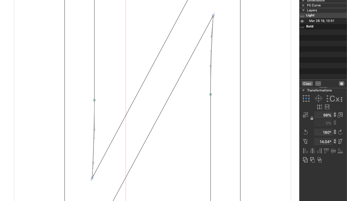
- Copy the existing layer to the background, and make that copied layer visible to provide a basic guide for my changes. For example: |
| 15 |
|
| 16 |
 |
| 17 |
|
| 18 |
I am not trying to change the design, but rather, to fix unintended vector issues that make the design less useful. |
| 19 |
|
| 20 |
### /U-cy |
| 21 |
|
| 22 |
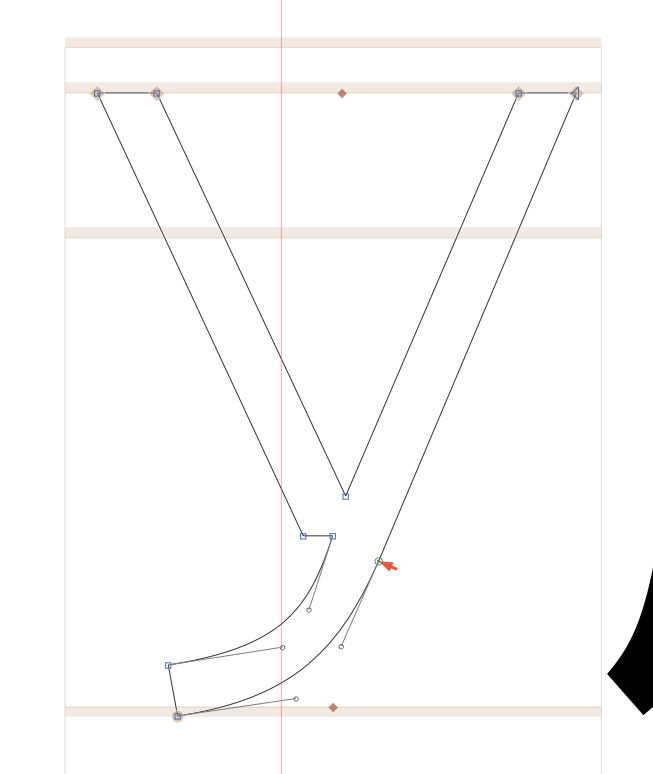
The main stem of this glyph has a "kink" that seems unintentional. |
| 23 |
|
| 24 |
 |
| 25 |
|
| 26 |
|
| 27 |
### Zhedescender-cy |
| 28 |
|
| 29 |
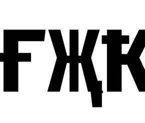
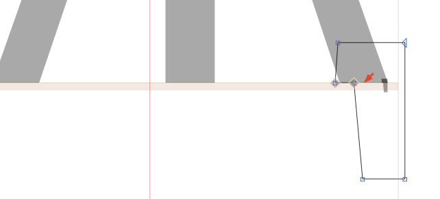
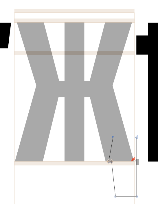
This has a component that isn't needed, and this juts out in the Bold master, causing an outline blip. |
| 30 |
|
| 31 |
 |
| 32 |
|
| 33 |
 |
| 34 |
|
| 35 |
 |
| 36 |
|
| 37 |
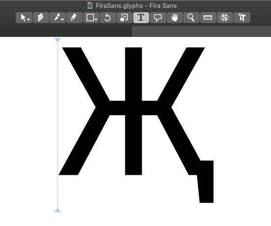
If we look at Fira Sans, it's clear what this shape is supposed to do: |
| 38 |
|
| 39 |
 |
| 40 |
|
| 41 |
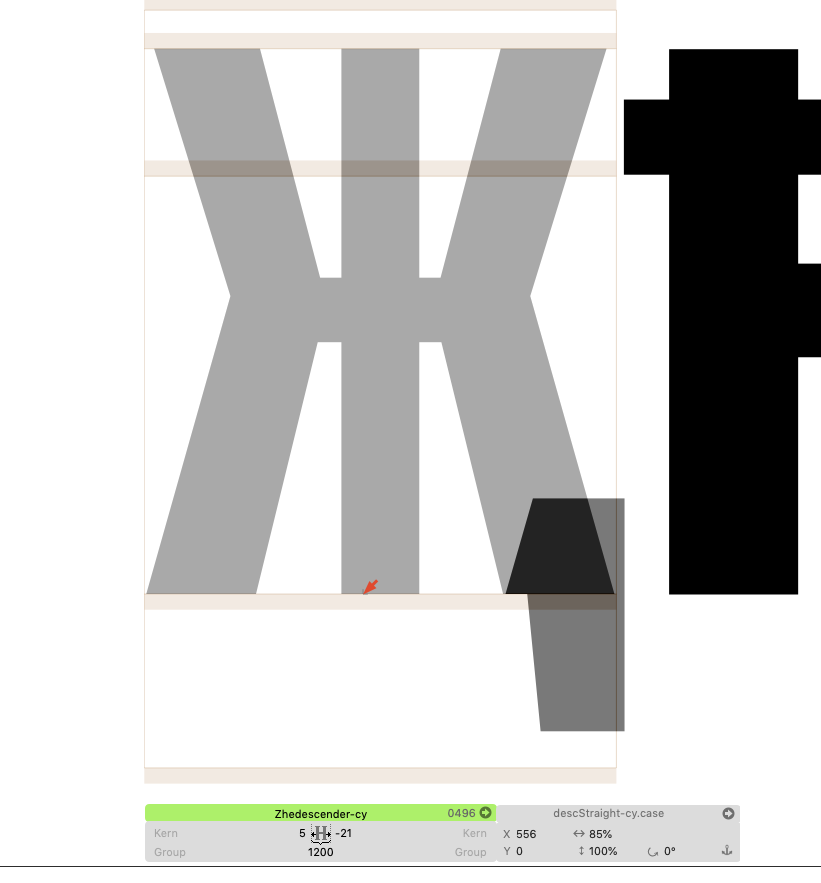
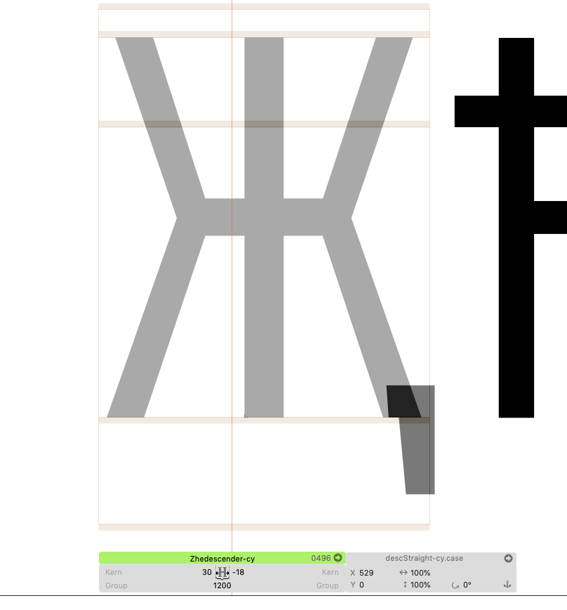
The component was transformed to (10%, 10%) – way too small. I've adjust that to (85%, 100%) in the Bold and (100%,100%) in the light. Now it's like this: |
| 42 |
|
| 43 |
 |
| 44 |
 |
| 45 |
|
| 46 |
|
| 47 |
## Kastroke-cy |
| 48 |
|
| 49 |
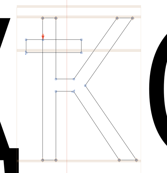
This crossbar is overly-thick, compared to others – I'll thin it out a bit: |
| 50 |
|
| 51 |
 |
| 52 |
|
| 53 |
|
| 54 |
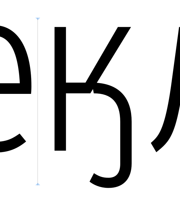
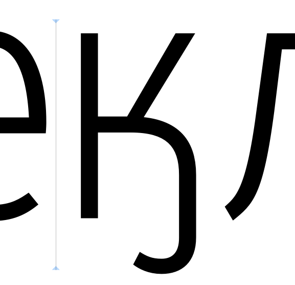
## Kahook-cy |
| 55 |
|
| 56 |
Before: |
| 57 |
|
| 58 |
 |
| 59 |
|
| 60 |
Now: |
| 61 |
|
| 62 |
 |
| 63 |
|
| 64 |
|
| 65 |
## Lha-cy |
| 66 |
|
| 67 |
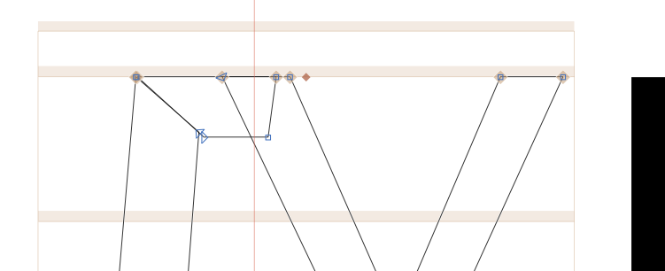
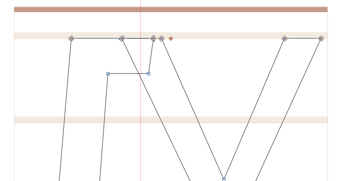
Mismatch in upper-left: |
| 68 |
 |
| 69 |
|
| 70 |
I removed the overlap in that stroke: |
| 71 |
|
| 72 |
 |
| 73 |
|
| 74 |
## be-cy |
| 75 |
|
| 76 |
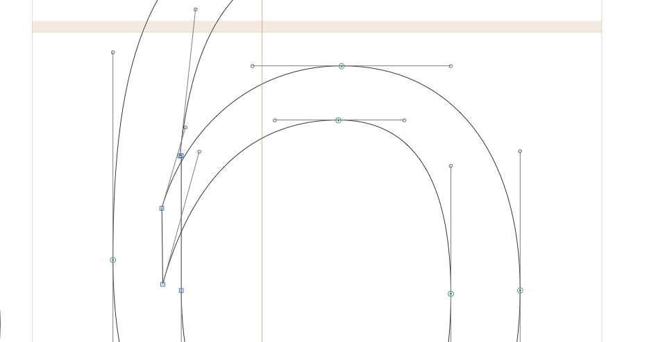
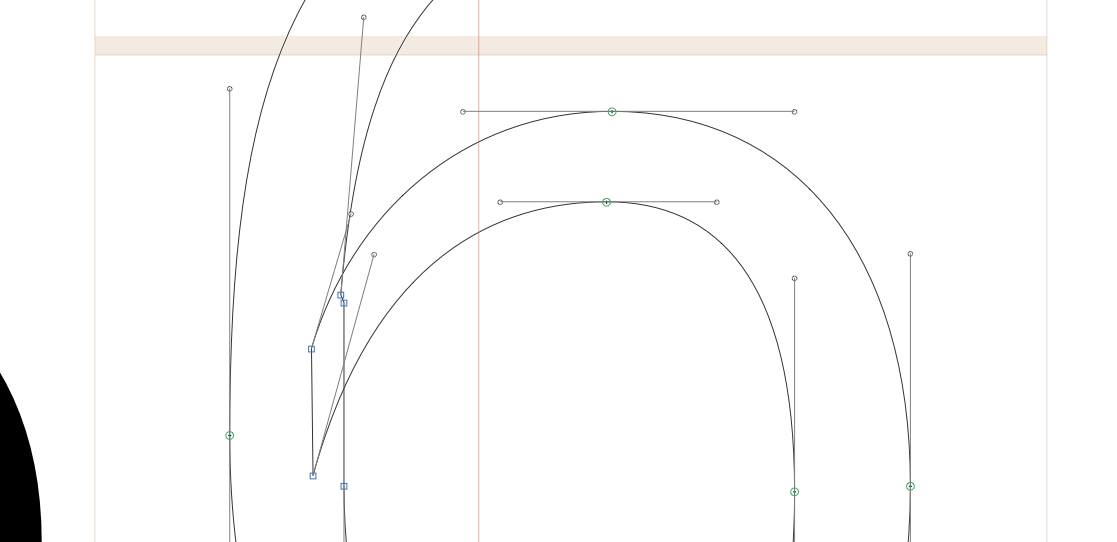
The ascender has an issue: |
| 77 |
|
| 78 |
 |
| 79 |
|
| 80 |
 |
| 81 |
|
| 82 |
## ve-cy |
| 83 |
|
| 84 |
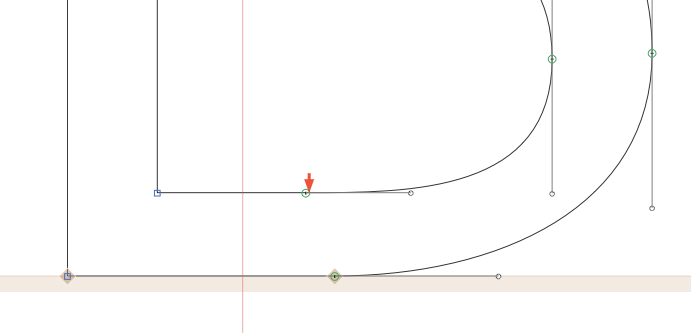
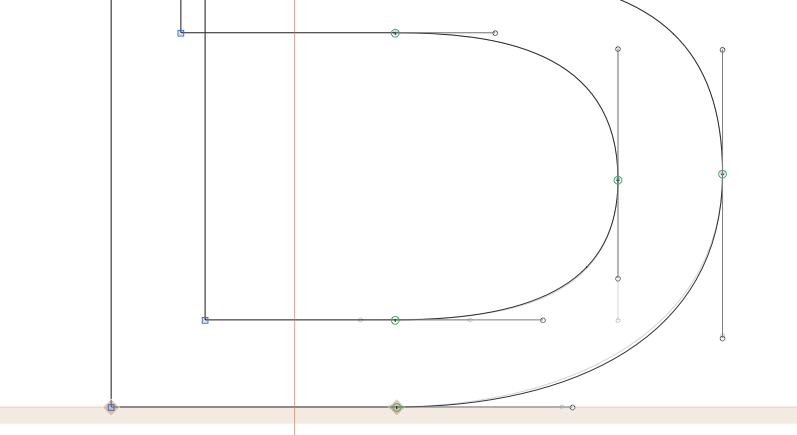
Inflected curve: |
| 85 |
|
| 86 |
 |
| 87 |
|
| 88 |
 |
| 89 |
|
| 90 |
## ze-cy |
| 91 |
|
| 92 |
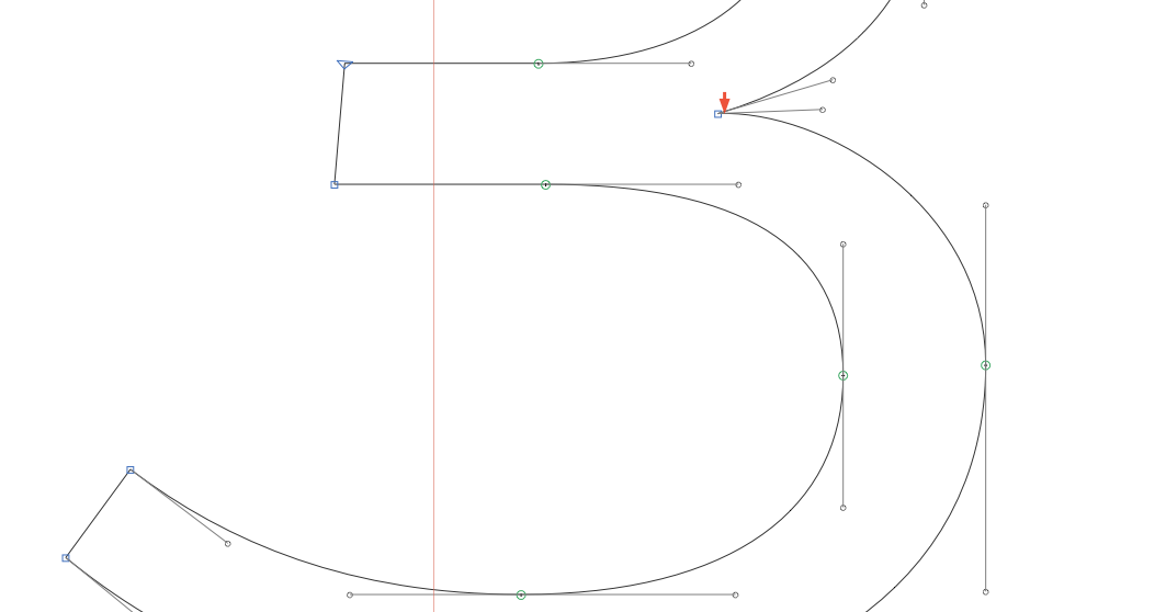
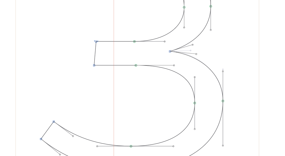
(Almost certainly) unintended curve upwards: |
| 93 |
|
| 94 |
 |
| 95 |
|
| 96 |
 |
| 97 |
|
| 98 |
## ii-cy |
| 99 |
|
| 100 |
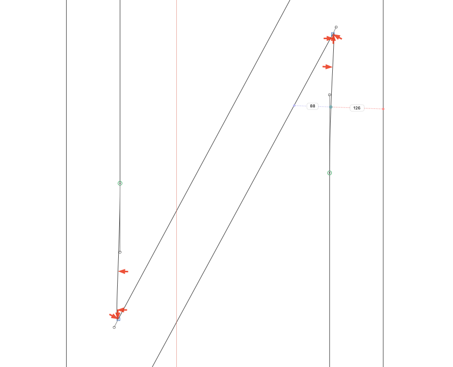
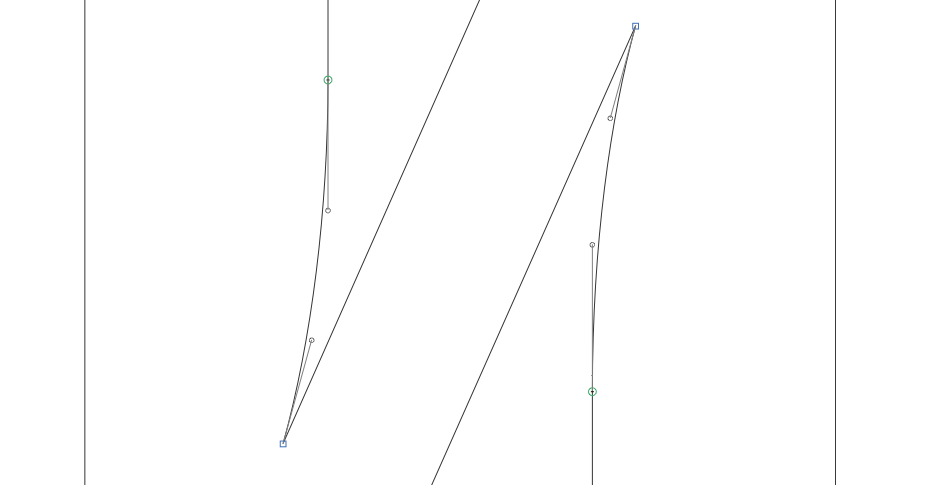
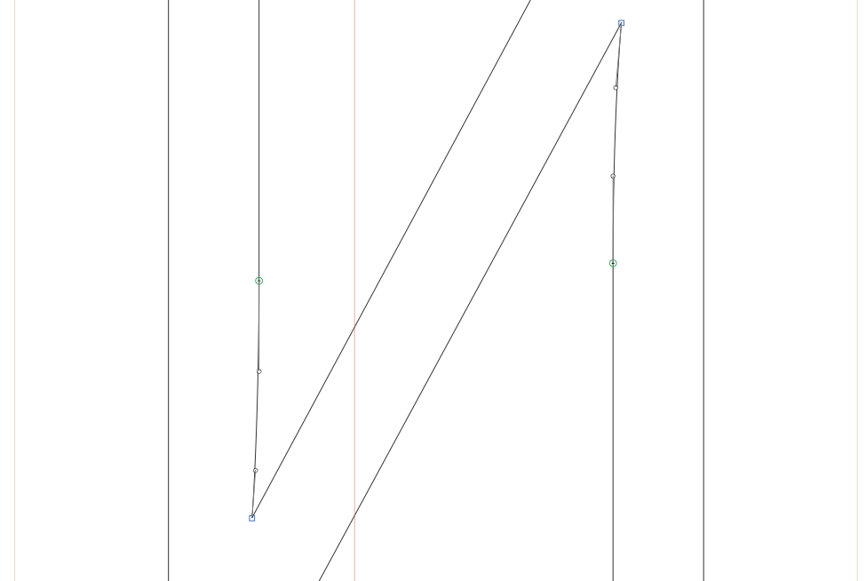
Unintended upwards-handles. |
| 101 |
|
| 102 |
 |
| 103 |
|
| 104 |
The bold looks better: |
| 105 |
|
| 106 |
 |
| 107 |
|
| 108 |
So: |
| 109 |
|
| 110 |
 |
| 111 |
|
| 112 |
### komije-cy |
| 113 |
|
| 114 |
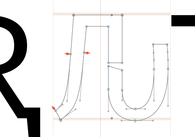
Ouch: |
| 115 |
|
| 116 |
 |
| 117 |
|
| 118 |
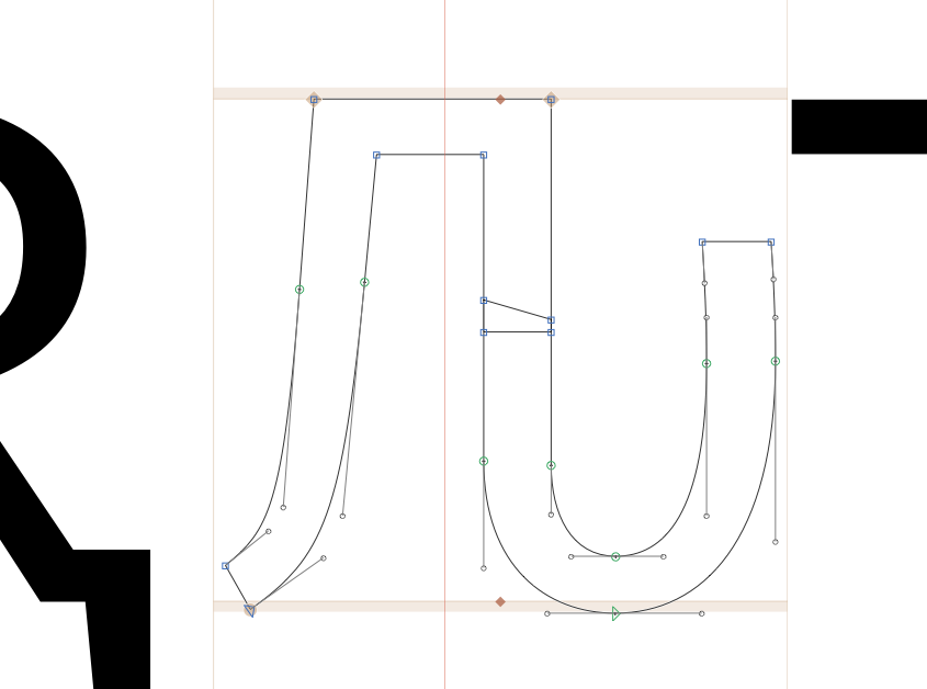
Better: |
| 119 |
|
| 120 |
 |
| 121 |
|
| 122 |
|
| 123 |
### Chi |
| 124 |
|
| 125 |
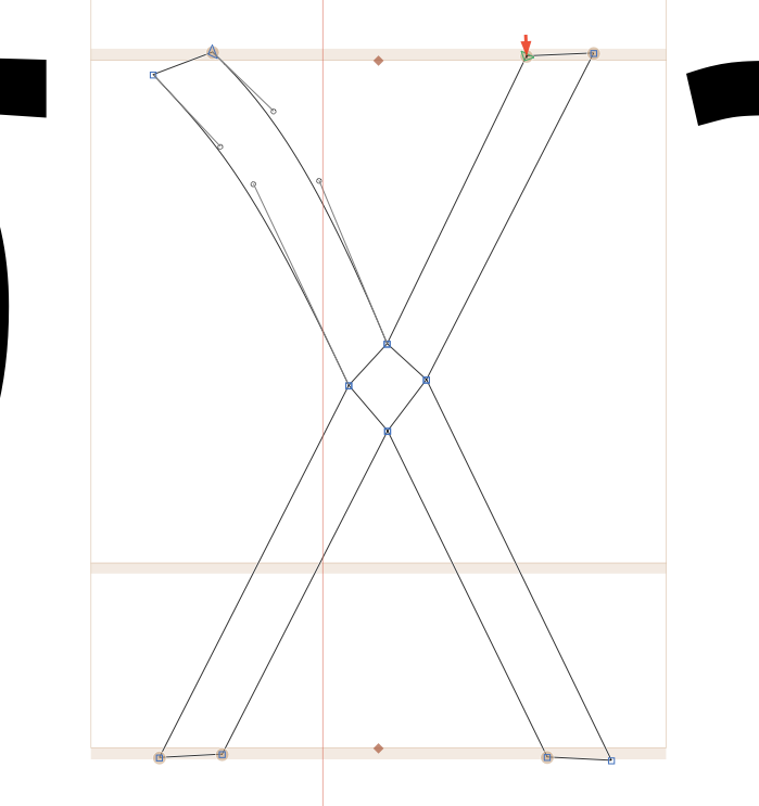
These feet aren't suppose to be angled so sharply: |
| 126 |
 |
| 127 |
|
| 128 |
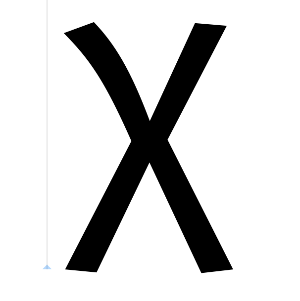
In Fira Mono, you can see that the angle simply becomes less steep: |
| 129 |
|
| 130 |
 |
| 131 |
|
| 132 |
|
| 133 |
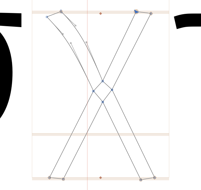
So: |
| 134 |
|
| 135 |
 |
| 136 |
|
| 137 |
### kaiSymbol |
| 138 |
|
| 139 |
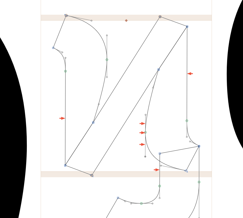
Not-quite-vertical strokes: |
| 140 |
|
| 141 |
 |
| 142 |
|
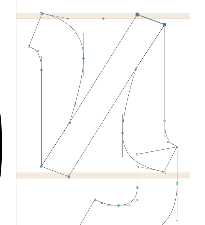
| 143 |
Straightened in Bold & Reg: |
| 144 |
|
| 145 |
 |
| 146 |
|
| 147 |
### betaSymbol |
| 148 |
|
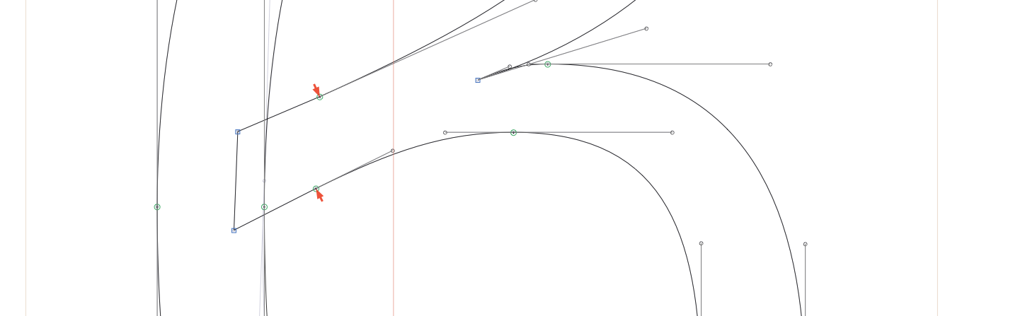
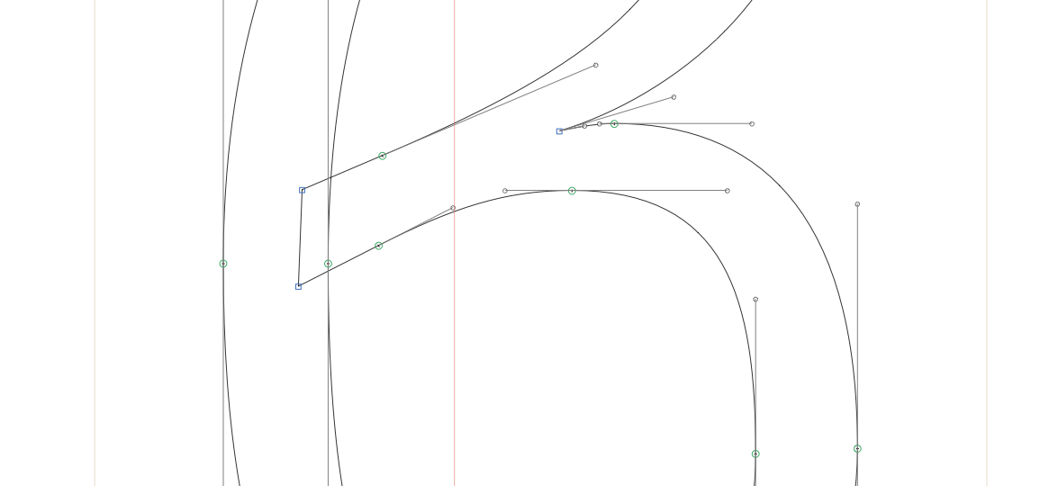
| 149 |
These lines are't supposed to intersect: |
| 150 |
|
| 151 |
 |
| 152 |
|
| 153 |
 |
| 154 |
|
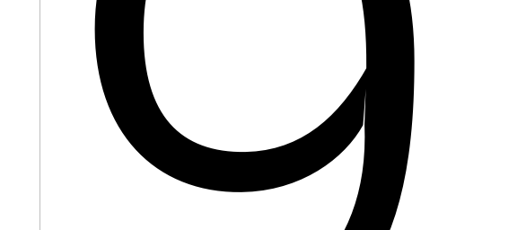
| 155 |
### Nine |
| 156 |
|
| 157 |
 |
| 158 |
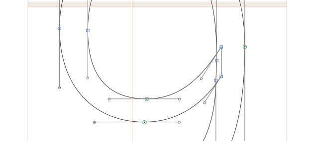
|
| 159 |
 |
| 160 |
|
| 161 |
(similar problem in /nine.tosf) |
| 162 |
|
| 163 |
|
| 164 |
### asciitilde_greater.liga |
| 165 |
|
| 166 |
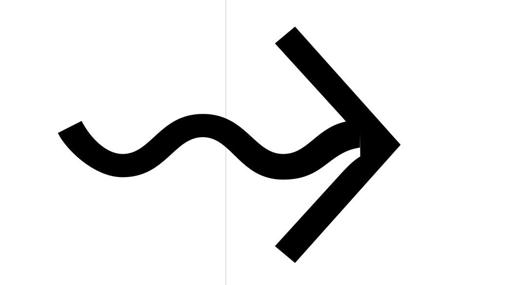
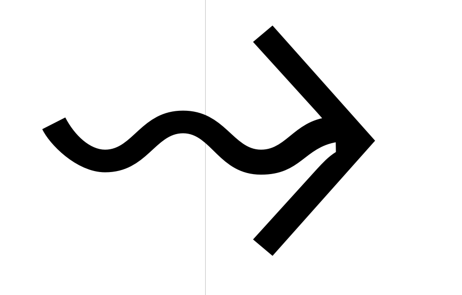
Broken connection on right side: |
| 167 |
|
| 168 |
 |
| 169 |
|
| 170 |
 |
| 171 |
|
| 172 |
### asciitilde_asciitilde_greater.liga |
| 173 |
|
| 174 |
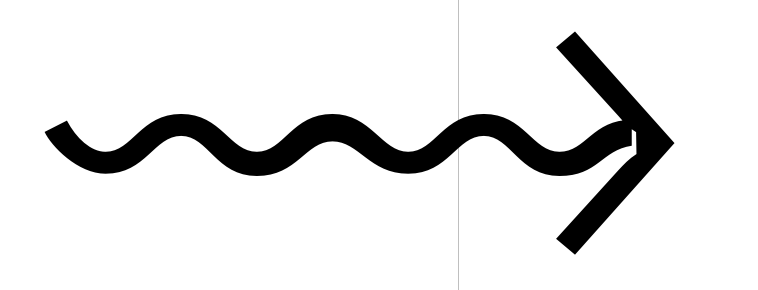
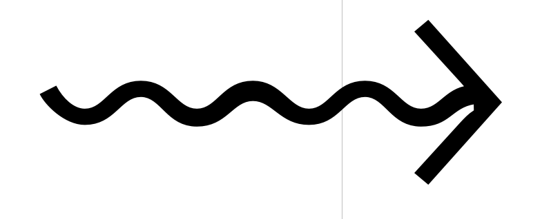
Broken connection on right side: |
| 175 |
|
| 176 |
 |
| 177 |
|
| 178 |
I've just scooted the curvy thing towards the arrow by a bit. |
| 179 |
|
| 180 |
 |
| 181 |
|
| 182 |
### uniE0A0 |
| 183 |
|
| 184 |
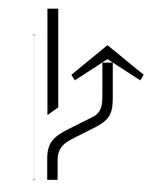
Broken connection: |
| 185 |
|
| 186 |
 |
| 187 |
|
| 188 |
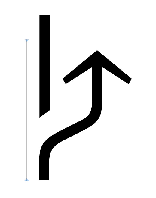
Fixed: |
| 189 |
|
| 190 |
 |
| 191 |
|
| 192 |
### r.001 |
| 193 |
|
| 194 |
 |
| 195 |
|
| 196 |
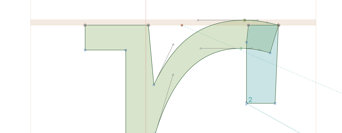 |
| 197 |
|
| 198 |
### ae |
| 199 |
|
| 200 |
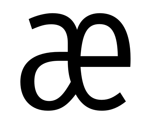
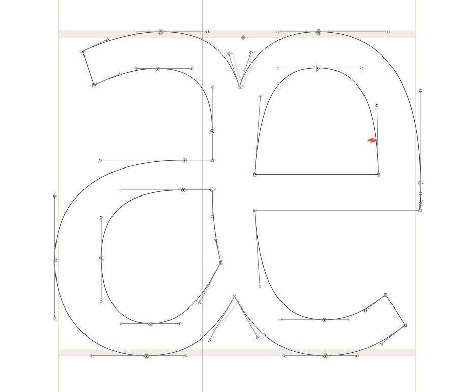
This curve isn't quite continuous: |
| 201 |
|
| 202 |
 |
| 203 |
|
| 204 |
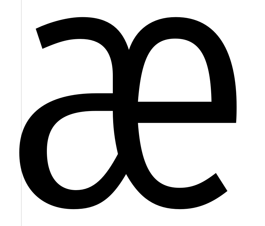
I've made it a little more graceful: |
| 205 |
|
| 206 |
 |
| 207 |
|
| 208 |
 |
| 209 |
|
| 210 |
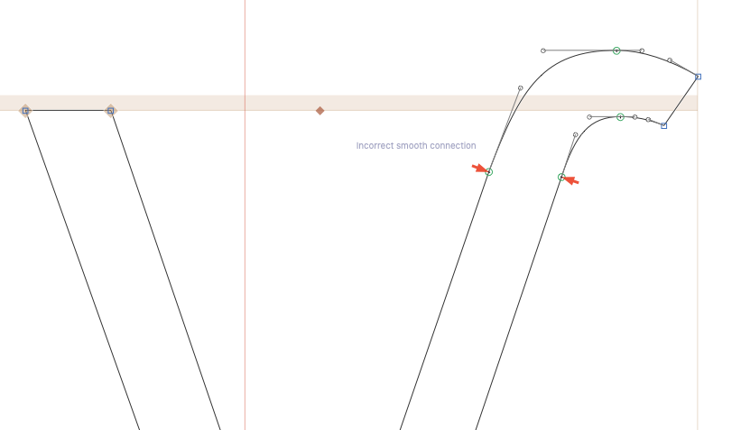
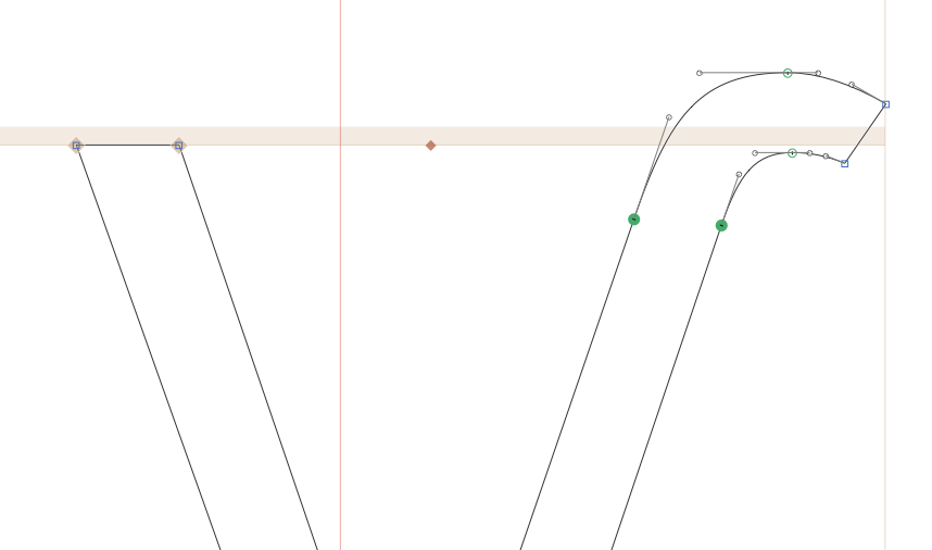
### "Incorrect smooth connections" in several glyphs: |
| 211 |
|
| 212 |
Like these slight kinks: |
| 213 |
|
| 214 |
 |
| 215 |
|
| 216 |
Should be this: |
| 217 |
|
| 218 |
 |
| 219 |
|
| 220 |
============================================================ |
| 221 |
|
| 222 |
## (Small) issues I'm leaving |
| 223 |
|
| 224 |
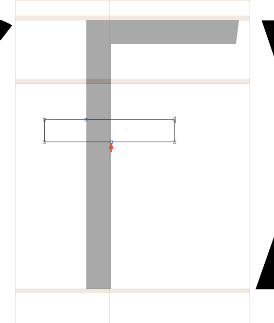
Often, crossbars have unnecessary points. These aren't really needed for the shapes and add a very small amount of data, but they're harmless, so I won't remove them right now. |
| 225 |
|
| 226 |
 |
| 227 |
|
| 228 |
|
| 229 |
--- |
| 230 |
|
| 231 |
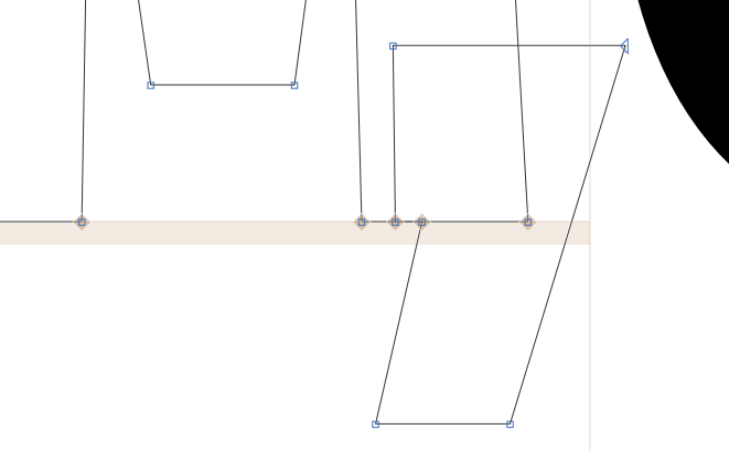
There are many instances of overlapping shapes that, while technically fine, might not render absolutely perfectly. I'll leave these, however, as they will probably bother no one. |
| 232 |
|
| 233 |
 |
| 234 |
|
| 235 |
--- |
| 236 |
|
| 237 |
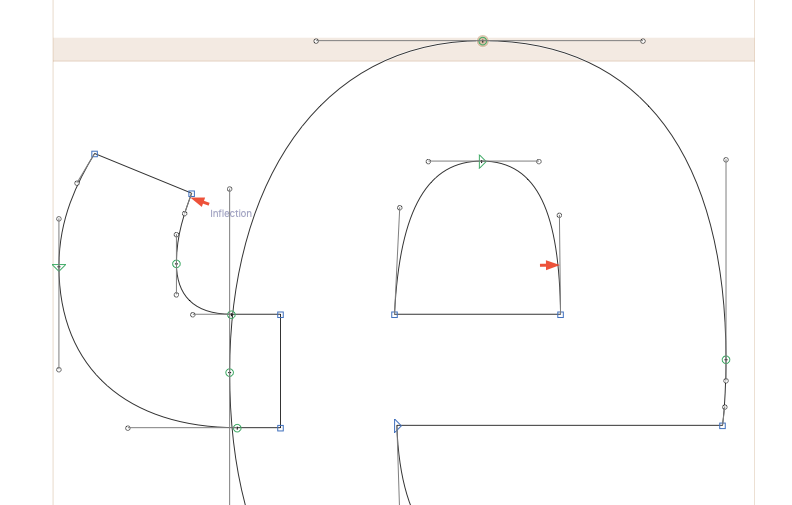
Small inflections, or semi-vertical handles that clearly should be that way: |
| 238 |
|
| 239 |
 |
| 240 |
|
| 241 |
--- |
| 242 |
|
| 243 |
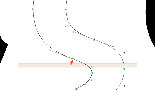
Some curvy shapes have slight issues around smooth connections. I'm looking at intermediate weights to make sure there aren't huge kinks (which is a concern in angled curve points), but otherwise mostly leaving these. |
| 244 |
|
| 245 |
 |